The Brief
A brand identity for a private jeweler, not a storefront
Hannah Florman left a career in corporate law in 2016 to design custom fine jewelry, and now works from The Brownstone, a private, by-appointment studio on Newbury Street in Boston, one of the first of its kind in the city. Her work favours clean lines and subtle geometry: curved bands, knife-edge details, modern heirlooms built for daily wear rather than a display case.
That model, private and by appointment rather than retail, set the brief: a jewelry brand identity built for intimacy, not footfall. The logo, stationery and packaging all needed to read as personal and considered, closer to a couture atelier than a jewelry chain, since for most clients a Hannah Florman piece marks one of the biggest moments of their life.


The Approach
A mark drawn from the jewelry itself
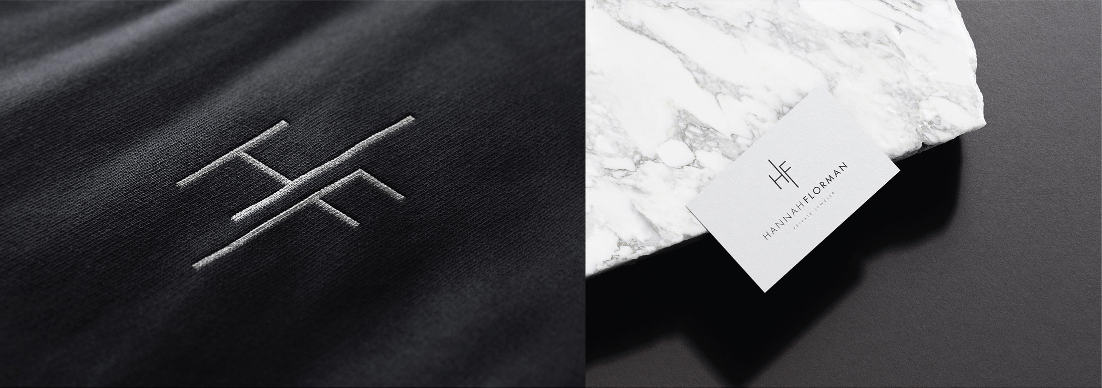
Hannah’s own design language, curved bands, knife-edge lines, quiet geometry, gave the logo design its starting point. The mark was built to sit comfortably next to the jewelry it represents: understated rather than ornamental, so the identity reads as an extension of the work, not a decoration applied on top of it.
Stationery and collateral for a by-appointment studio
A private jeweler’s paper trail (business cards, letterhead, brochure) carries more weight than it would for a retail brand, since it’s often the only printed material a client takes home before a piece is finished. Stationery and brochure design were built around the same restraint as the logo: quality of material and finish doing the work that a shopfront would do for a walk-in jeweler.
Packaging as the final reveal
For an engagement ring designer, the box is rarely just packaging, it’s often present at a proposal. Bag and box design were treated as part of the brand identity’s most emotional touchpoint, built to feel as considered closed as the piece inside is once it’s opened.


The Result
The finished brand identity gives Hannah Florman a single, considered presence across logo, stationery, brochure and packaging, one built for a private, by-appointment jeweler rather than borrowed from a retail template. Every touchpoint, from a business card handed over at The Brownstone to the box a finished ring leaves in, now carries the same quiet, geometric language as the jewelry itself.
For a jeweler whose business depends on referral and reputation as much as walk-in traffic, that consistency matters: it’s often the identity, not a storefront, that a client’s first impression is built on.
Logo design
Visual identity system
Stationery and business collateral
Brochure design
Packaging: bags and boxes