The Brief
A name that means the top level
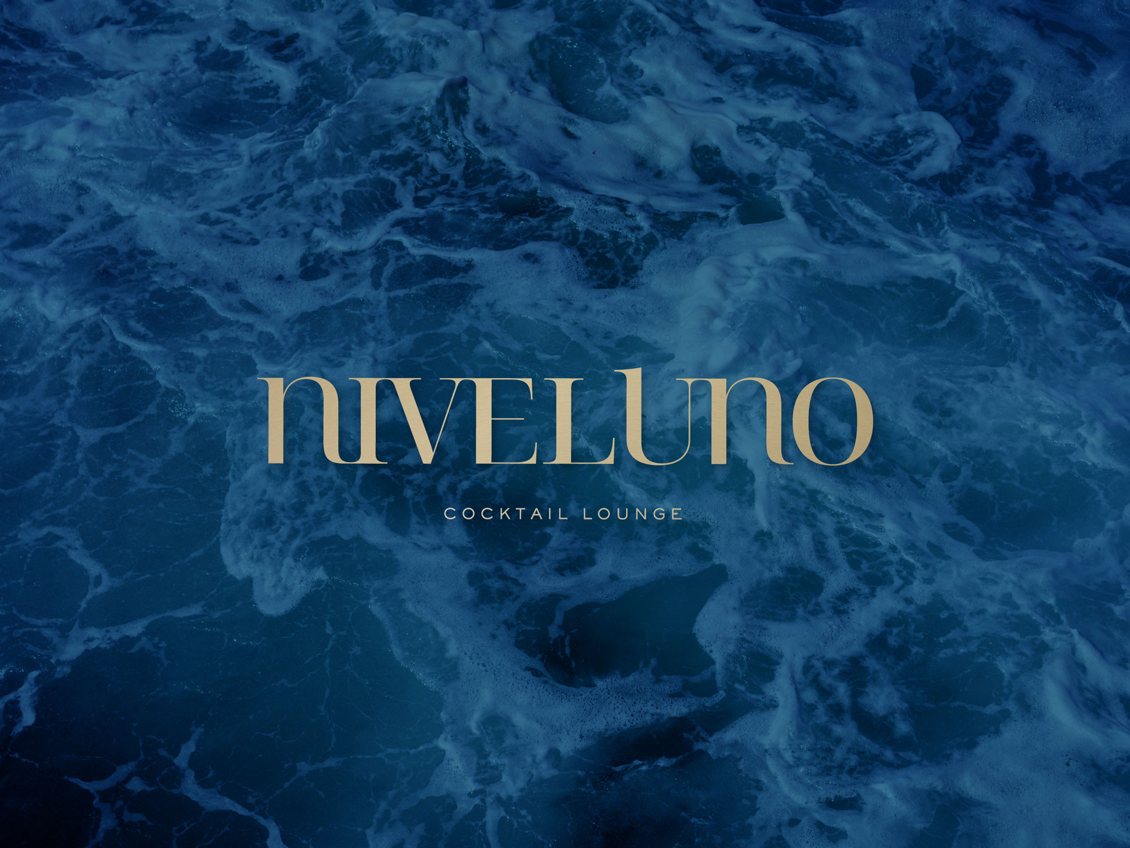
Nivel Uno, Spanish for “level one”, needed a naming and logo design that could hold its own in Málaga’s crowded cocktail bar scene, where a name has to signal quality before a single drink is served. The brief was narrow in scope but exacting in standard: naming, logo design and a visual identity built for a nightlife brand competing on the Costa del Sol, from the mark on a menu to the label on a bottle.
A name built around “level” gave the identity a natural direction: elevation, ranking, the sense of a bar operating a level above the rest. That idea, rather than a literal illustration of a cocktail glass, became the starting point for the mark itself.


The Process
Naming as the foundation of the identity
Naming came first, ahead of any visual exploration. A cocktail bar logo design only works if the name behind it already carries the right tone: confident, short, easy to say after a couple of drinks. Nivel Uno delivered that in two words, and the naming manual set out how the name should be used, spoken about and abbreviated before a single logo sketch was drawn.
A mark built to work small and animated
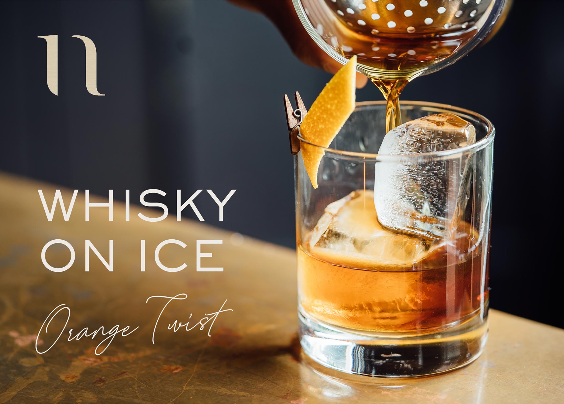
Cocktail bar branding lives on small surfaces as often as large ones: a matchbook, a coaster, a bottle label, an Instagram profile. The logo was designed to hold its detail at business-card scale, then extended into a short animated version of the mark for digital and social use, giving Nivel Uno a moving signature as recognisable as its static one.
Identity extended into print, product and web
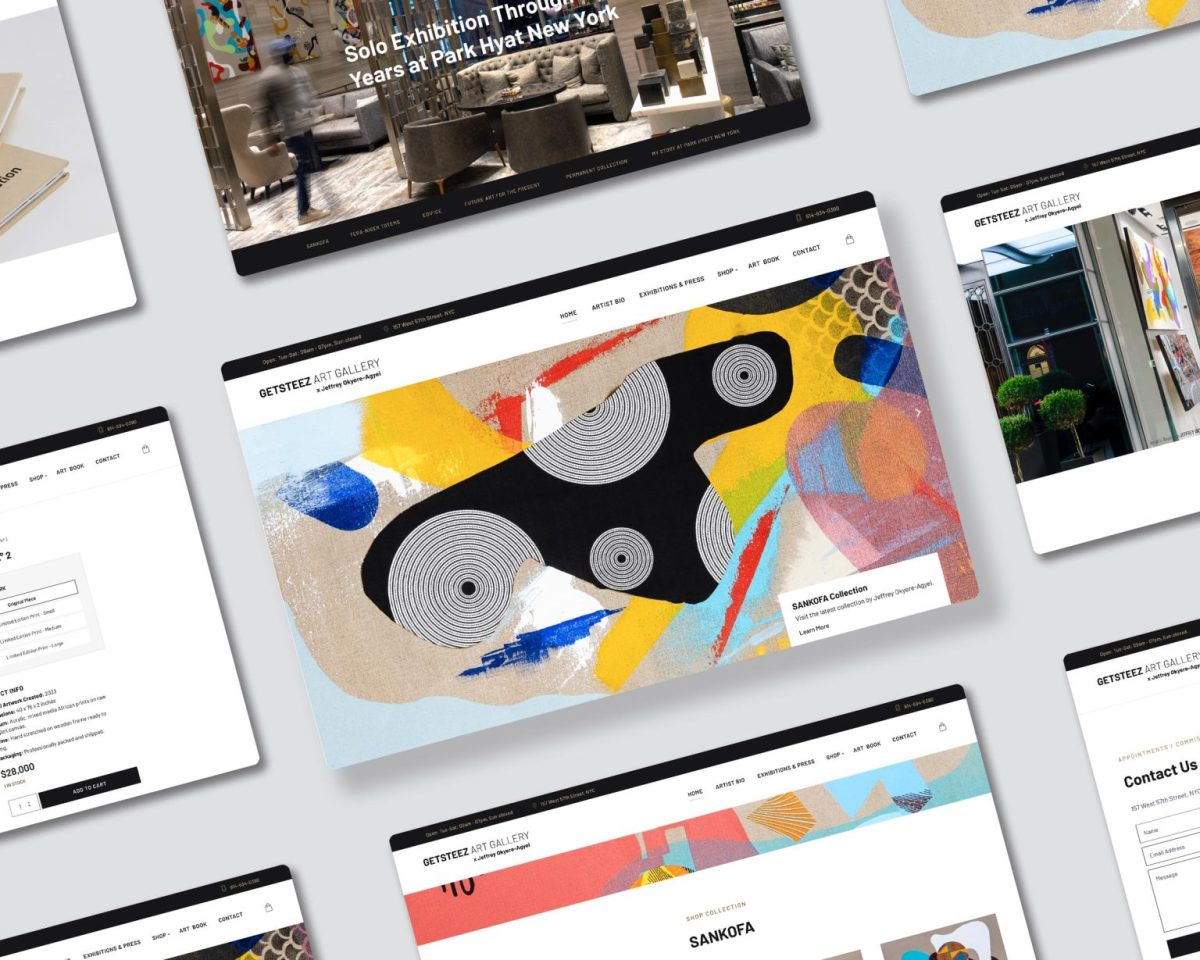
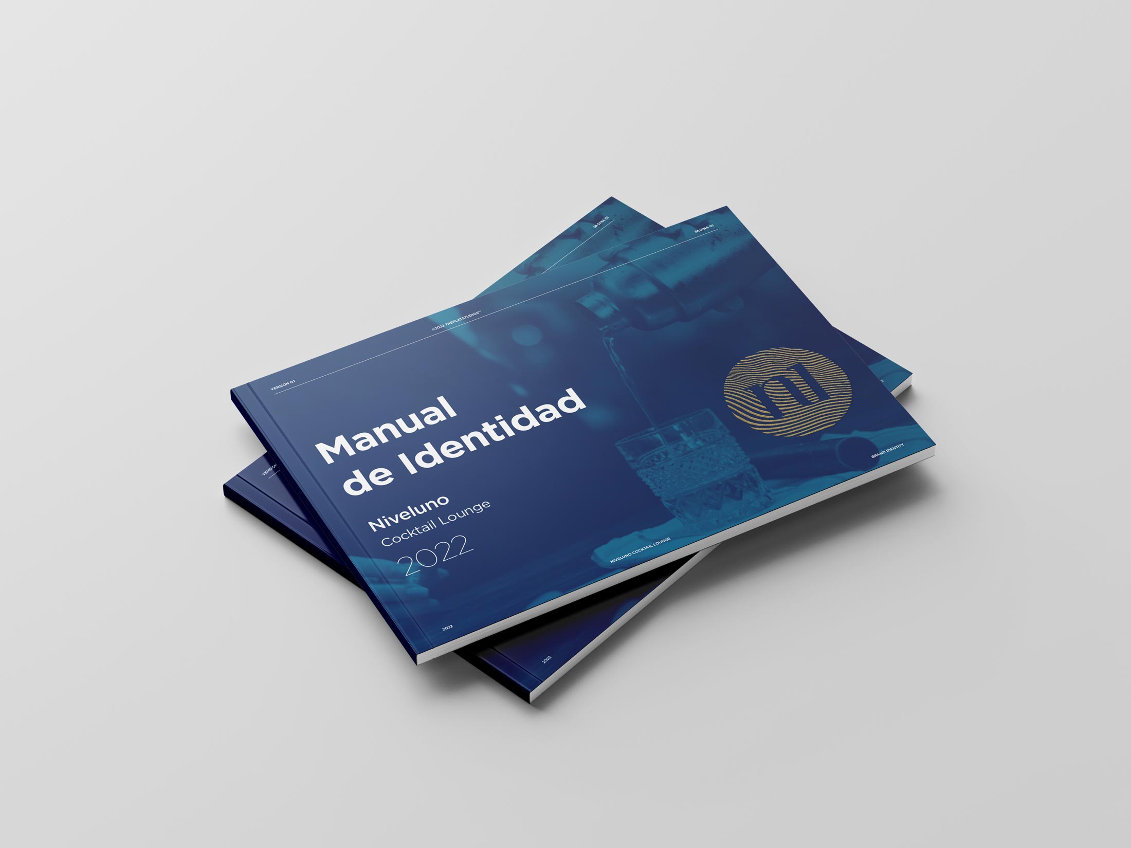
The visual identity carried through a full brand guideline book, applied packaging on spirits and bottle labels, and into the bar’s own website design, so that the same logo design and colour system a guest sees on a cocktail menu is the one they find searching for the bar online.


The Result
Nivel Uno launched with a complete brand identity rather than a logo in isolation: a name, a mark, an animated signature, and a guideline book to keep all of it consistent as the bar grows, from print through to web. For a nightlife brand on the Costa del Sol, where a first impression happens at the door or on a phone screen before a guest ever orders a drink, that consistency is the difference between looking new and looking established.
Naming and naming rationale
Logo design, static and animated
Visual identity system and colour palette
Brand guideline manual
Applied branding: bottle labels and packaging
Identity extended into web design