The Brief
A sales document for clients who value experience
Y Charter Miami presents private yacht charters across the Caribbean and Mediterranean. The challenge was to create a brochure that felt as considered as the experiences it represents—one that informed, inspired, and remained engaging beyond the first read.
The audience is experienced. They have chartered before. Their decision is rarely based on specifications alone, but on the quality of the experience: a secluded anchorage, an unhurried itinerary, the feeling of being entirely removed from routine.
The design approach was editorial rather than promotional, using imagery, pacing, and typography to create a sense of anticipation and escape. The aim was not to overwhelm with information, but to balance practical detail with atmosphere, allowing the reader to imagine the journey before it begins.
We conceived the editorial structure, art directed the visual language, and oversaw production from initial concept through to final print.


The Process
Restraint as strategy
The design approach for the Y Charter Miami brochure was led by restraint. The cover is black and unadorned, with a grey compass motif and subtle silver tint. The logo is applied in silver hot stamping, introducing a refined material contrast rather than overt decoration. No photography is used on the cover, allowing material, typography, and finish to define the first impression of this luxury yacht charter brochure.
Inside, yacht charter photography is presented without captions or location labels. The emphasis shifts away from geography and toward atmosphere: light, water, and the experience of time at sea. Text is used sparingly, appearing only where it adds clarity or context.
Format and grid
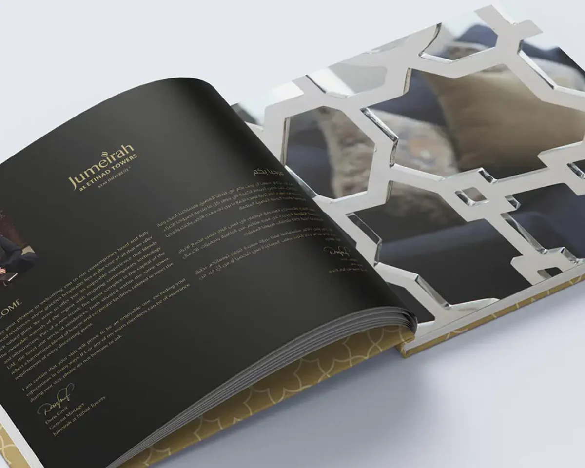
The brochure is designed to feel closer to a premium editorial publication than a standard sales document. The layout is structured through a flexible grid, allowing each spread to operate independently.
Full-bleed yacht imagery is balanced with typographic spreads to establish rhythm and pacing throughout the book. This structure supports the communication of luxury yacht charter services in the Caribbean and Mediterranean in a way that feels immersive and considered.
Typography is deliberately restrained, set in a single weight to maintain consistency and avoid unnecessary hierarchy. The visual rhythm is defined by imagery and composition rather than typographic contrast.
Art direction
We worked with Y Charter Miami’s existing photography archive, selecting imagery under a clear direction: no staged interiors, no posed crew arrangements. The focus is on authentic yacht charter photography that captures life on board.
The selection highlights the experience of luxury yacht chartering—water, light, movement, and atmosphere—positioning the service not as a vessel-led product, but as a way of experiencing time at sea.


The Result
The collection brochure entered circulation with Y Charter Miami’s key accounts across Miami, Nassau, and Palma de Mallorca. The format remained in active use across multiple charter seasons, becoming a consistent reference within their luxury yacht charter sales materials.
The project reinforced a principle central to our editorial work: in luxury communication, clarity is not achieved through accumulation, but through selection. The audience is not persuaded by what is shown, but by what is intentionally left out.
Concept development and editorial architecture
Art direction and photography selection
Typography system and grid design
Print specification and production management
Corporate collection brochure · Dossier format · Premium boards