The Brief
A collector’s object for one of Manhattan’s most considered addresses
Park Hyatt New York sits within One57, the slender tower that redefined the Manhattan skyline. The hotel’s brief was deceptively simple: create an in-room book worthy of the space. Not a catalogue. Not a brochure. A book guests would want to take home.
The challenge was one of restraint. One57 attracts guests who have seen everything — collectors, curators, executives for whom luxury is the baseline. Any gesture toward conventional hotel publishing would read as exactly that. The book needed to function as an art object first, and as a guide to the property second.
We were commissioned to conceive, design, and art-direct the entire publication: from the editorial architecture down to the weight of the paper stock.

The Process
Editorial architecture
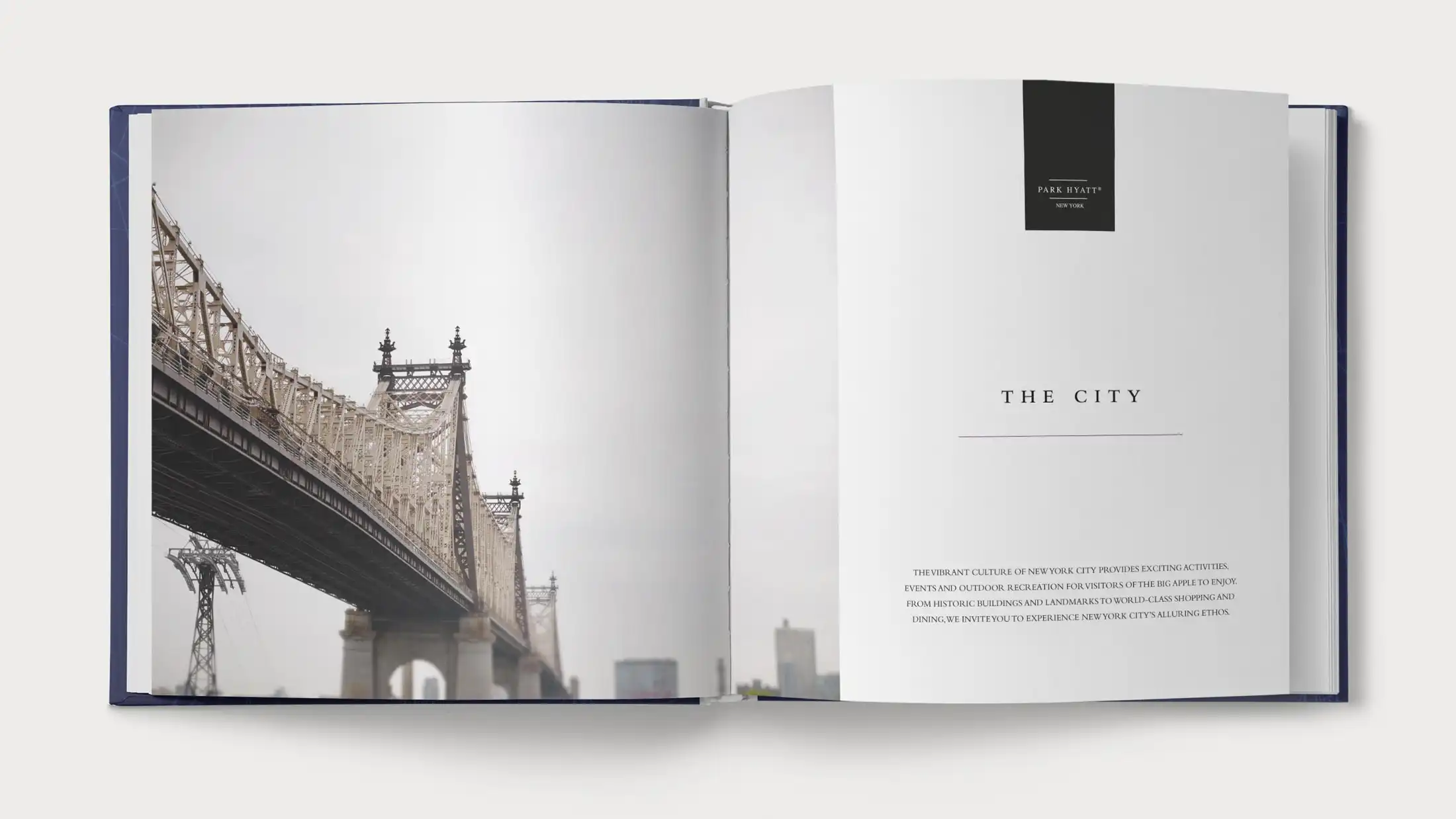
We structured the book around five chapters, each corresponding to a distinct sensory register of the hotel: arrival, space, light, taste, and rest. This gave the narrative a choreographic logic — the guest moves through the book the way they move through the hotel, with each chapter opening at a different hour of the day.
The chapter system also solved a practical problem. A book covering all aspects of a 210-room property risks feeling encyclopaedic. By subordinating content to experience, we gave the editorial team a filter: does this image, this anecdote, this detail, belong to one of the five registers? If not, it was cut.
Typography and grid
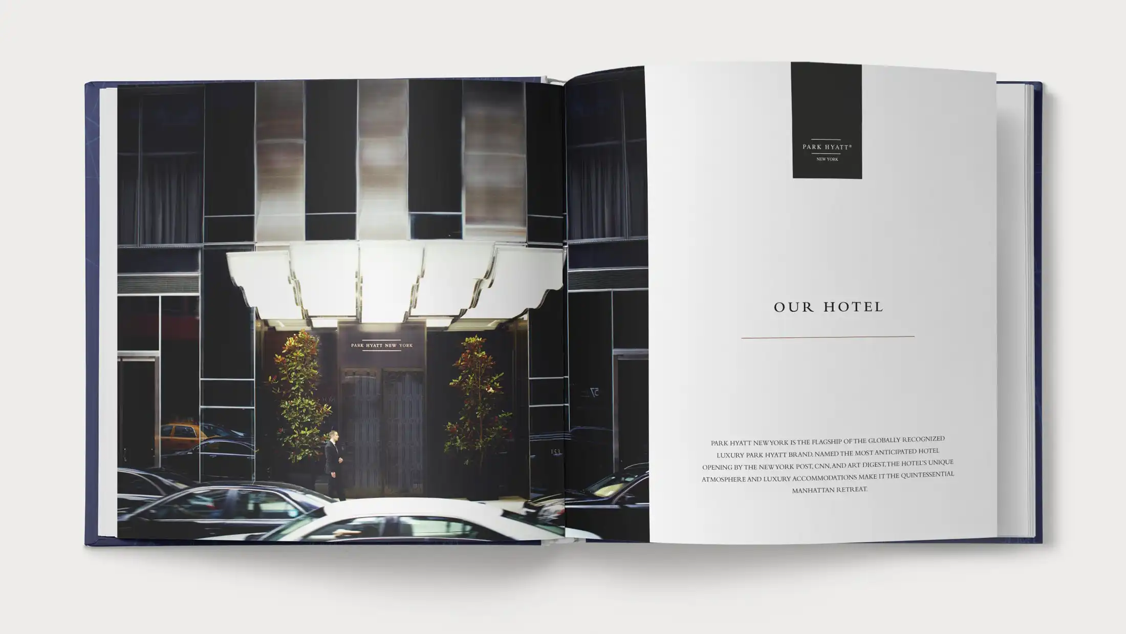
We built the typographic system around a single serif — spare, vertical, with the proportions of early 20th-century American book typography. Headlines run large and unadorned. Body text sits in a narrow measure, close to the binding, forcing the eye toward the photographs on the facing page. Folios are set in a smaller point size than most designers would be comfortable with. This is intentional: the book does not want to be navigated. It wants to be read.
The grid is based on a nine-column structure that allows spreads to read as either balanced compositions or deliberate asymmetries. The most important photographs — the views from the upper floors, the detail of the Carnegie Hall facade — bleed to the fore-edge. Everything else respects the margin.


Publication specs
Materials and production
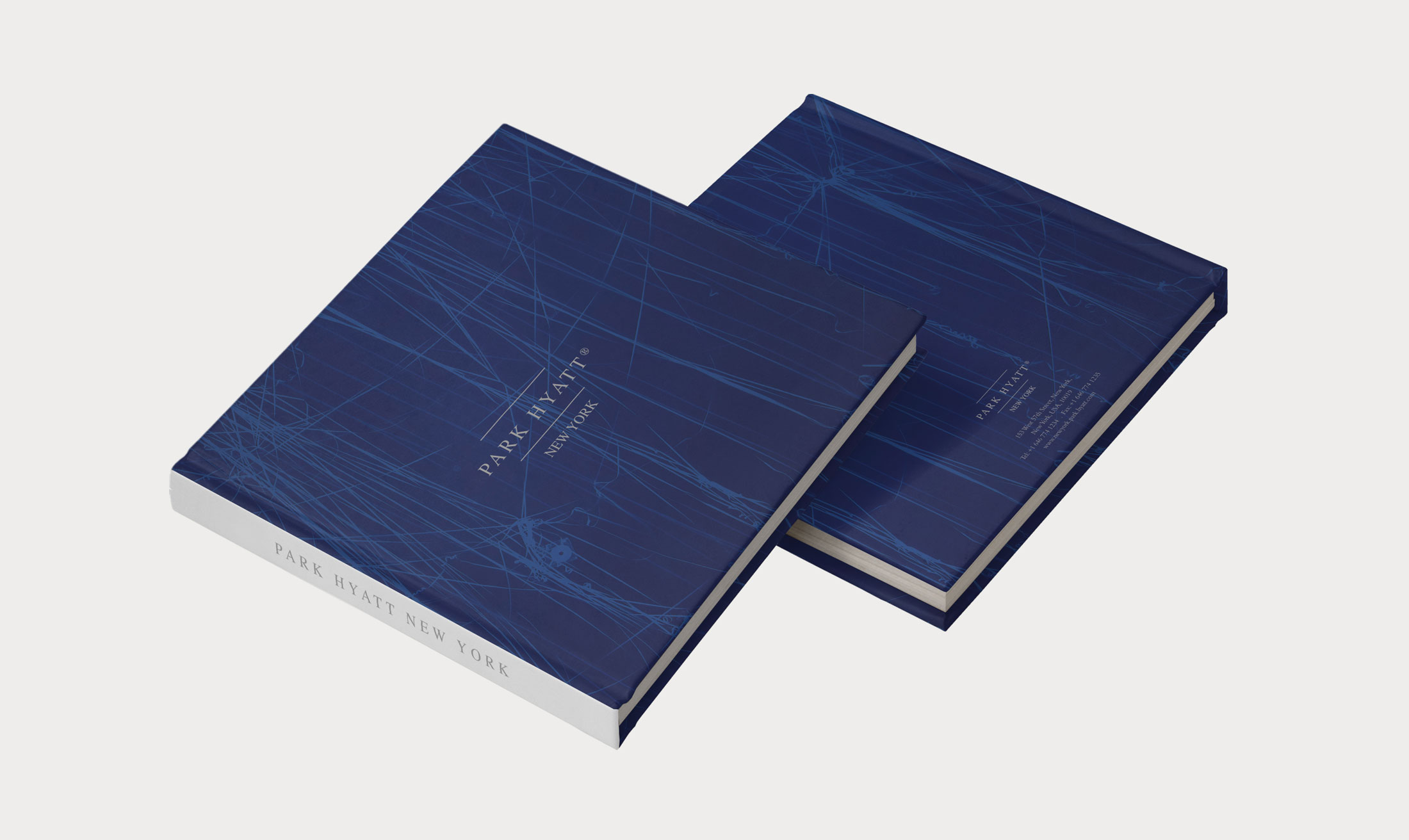
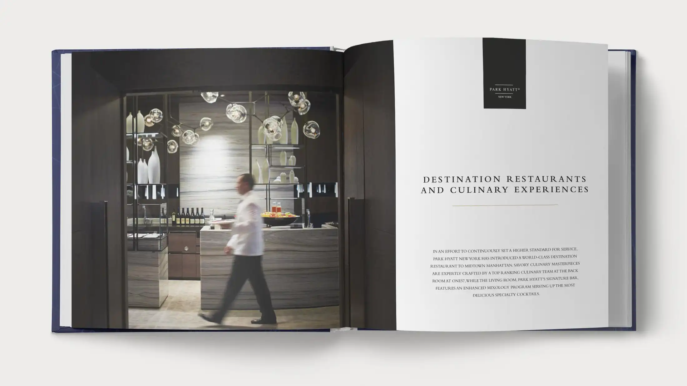
The book is presented as a 156-page hardcover volume, conceived as a collectible object rather than a conventional hotel publication. Bound in a case-wrapped cover featuring custom artwork inspired by the energy and geometry of New York City, it carries the Park Hyatt New York wordmark in a refined silver foil finish. The absence of a dust jacket allows the cover design to remain uninterrupted, giving the book a clean and contemporary presence.
Inside, the publication is printed on an uncoated 150gsm stock selected for its ability to reproduce photography with depth and subtle tonal richness while maintaining a tactile, premium feel. Chapter openers are distinguished by a heavier-weight paper with a slight cream tone, creating a natural rhythm throughout the book and signalling transitions between sections without relying solely on layout changes.
Printing was handled by a specialist printer in the United States with extensive experience in premium art and photography books. Multiple rounds of press proofs were reviewed to ensure accurate colour reproduction and to preserve detail in both highlights and shadow areas. The final print run consisted of 1,000 copies, produced exclusively for the hotel and distributed across its suite categories as a lasting keepsake for guests.


The Result
The completed book was introduced across all suite categories at the property’s launch. Guests routinely contact the hotel to purchase additional copies — a reliable indicator that an in-room publication has crossed from amenity to object of desire.
The project established a working model we have applied to subsequent hotel publishing commissions: structure before content, restraint before decoration, object quality before page count.
Editorial architecture and chapter structure
Typography system and grid design
Production management and press supervision
156-page hardcover, linen-bound, 1,000 copies