The Brief
A publication to introduce guests to one of Abu Dhabi’s most distinctive addresses
The brief was direct: produce a hotel publication that would give guests a complete portrait of Jumeirah at Etihad Towers — its spaces, its offer, and the character of the property. A book to be placed in guest rooms, to be read and kept.
The Etihad Towers complex occupies a singular position in Abu Dhabi, its five towers rising above the Corniche in a form that has become inseparable from the city’s skyline. The publication needed to reflect that scale and confidence while remaining warm and personal in the hands of a guest.


The Process
The Cover
The cover is case-bound in white cloth, clean and without surface decoration. The photograph of the Etihad Towers complex at dusk is printed as a centred panel framed by a thin gold border — the towers illuminated in deep blue against the Abu Dhabi sky. The Jumeirah logo appears in the upper right corner; the tagline “Stay Different™” in a smaller weight below. The restraint of the cover is deliberate: the photograph carries the identity of the property without the need for additional design.
Bilingual design: English and Arabic
The book is produced in two languages throughout — English and Arabic. The two languages are given equal presence on the page, with Arabic set right-to-left in its own typographic system. The Welcome spread opens the book with a portrait of the General Manager and a letter in both languages, establishing from the first spread that the publication belongs equally to both audiences.
The geometric pattern
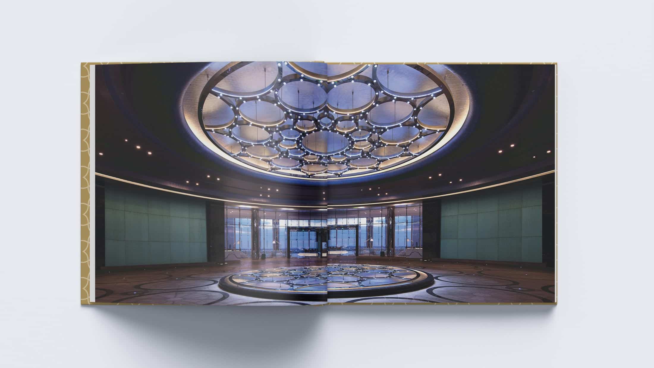
A recurring decorative element throughout the book draws from the Islamic geometric tradition — a lattice of interlocking forms that references the mashrabiya screens found throughout the property’s architecture. The pattern is used on the spine in gold, and appears across chapter dividers and detail spreads as a connecting visual thread between the contemporary hotel and the architectural heritage of the region.


The Result
The completed 160-page publication was distributed across guest rooms at Jumeirah at Etihad Towers, giving every arriving guest a considered introduction to the property — its architecture, its spaces, and the experience it offers.
Cover design: gold-framed photo panel
Editorial design and thematic chapter structure
Bilingual layout: English and Arabic throughout
Geometric Islamic pattern design for spine and chapter dividers
Print management and press coordination