The Brief
Between the harbour and the mountain. A portrait of the most particular address in Hong Kong.
The Four Seasons Hong Kong occupies a position that is almost impossible to replicate: one side faces Victoria Harbour, the other looks toward the peaks of Hong Kong Island. The hotel stands at the intersection of two orientations — outward, toward the city and the water, and inward, toward quiet and contemplation.
The brief asked us to produce an art book that would communicate this duality without explaining it. Not a celebration of amenities, but an editorial study of the hotel’s relationship with its location — with light, with movement, with the particular quality of stillness that exists inside a property surrounded by one of the world’s most kinetic cities.
The book was conceived as a permanent fixture in suites above the 30th floor, where the view changes with the weather, the hour, and the season. The publication needed to earn its place alongside that view.
The Process
The Cover
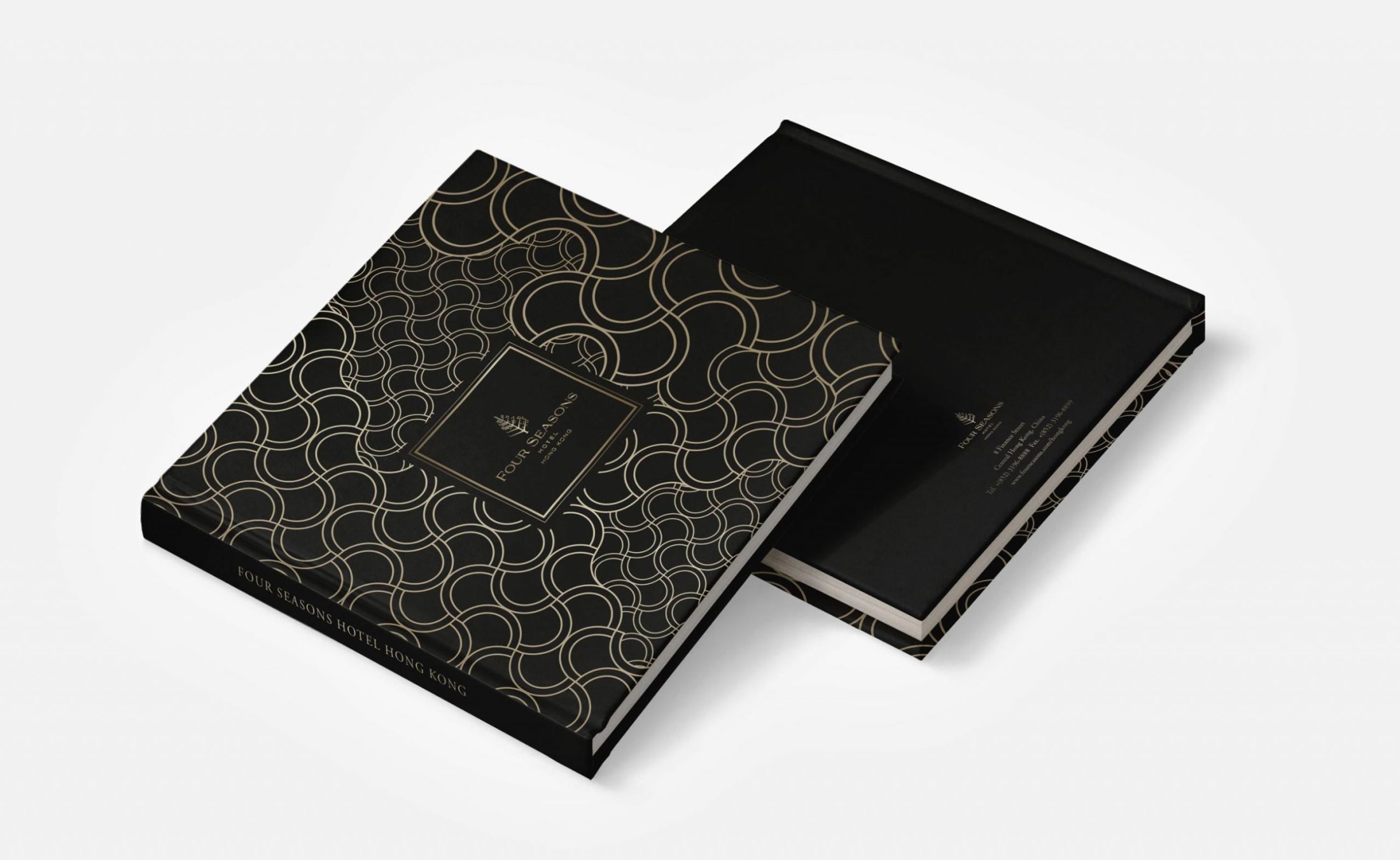
The cover is built around a hand-drawn geometric pattern — a lattice of interlocking ovals that reads simultaneously as a traditional Chinese motif and as an abstraction of the harbour’s surface. The repetition is precise but not mechanical: the spacing and weight of each element were calibrated to work at book scale, where the pattern needed to read as texture from a distance and as fine detail on close inspection.
The pattern is applied by hot stamping in gold on a deep black case-bound cover, with no additional typography on the front face. The Four Seasons wordmark appears on the spine, also in gold foil. The result is a cover that communicates luxury entirely through material and craft — before the book is opened.
Typography and language
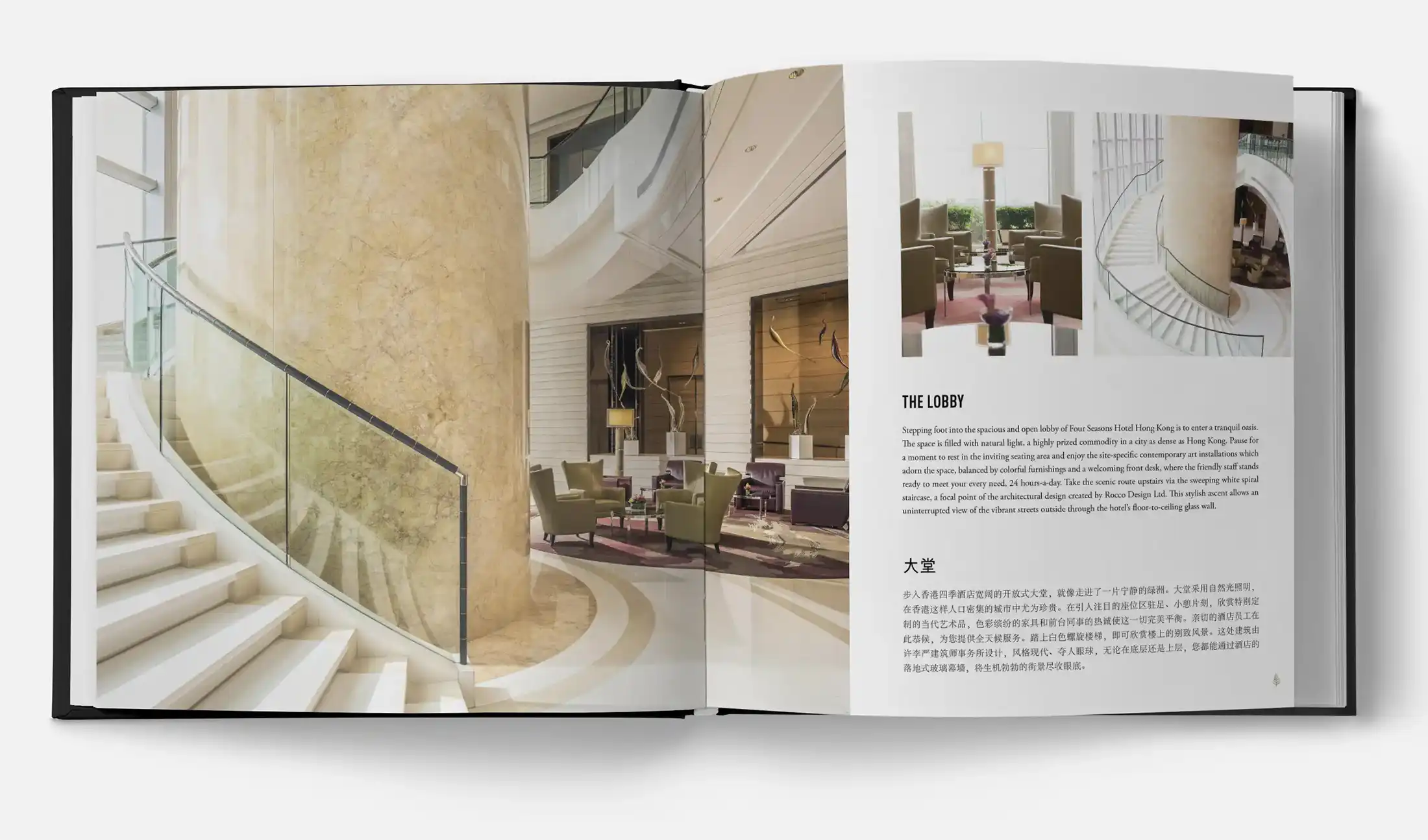
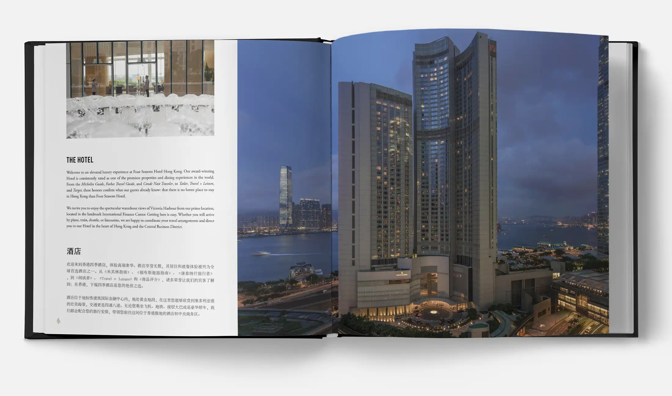
The typographic system inverts the conventional hierarchy: headlines are set in a geometric sans-serif — uppercase, tracked out, with an almost architectural calm — while body text is set in a classical book serif. The contrast between the two registers is deliberate. The sans-serif headline announces each chapter with precision and restraint; the serif body text invites reading at a slower pace. Together they signal that the book belongs to two worlds: the contemporary hotel and the tradition of considered publishing.
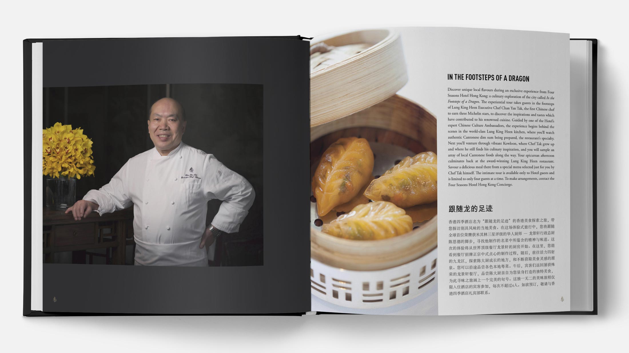
The book is bilingual throughout — English and Traditional Chinese — with both languages given equal weight on the page. This was not a translation exercise but a design decision: the Chinese text is not a caption to the English, nor the English a caption to the Chinese. Each reads as the primary version of itself.


The Result
The shoot produced a lifestyle and interior photography library now in use across Graffiti Suites’ website, booking channels and social media, images that sell an idea as much as a room: a stay built on self-expression, in a city where street art, museums and Andalusian architecture sit within a few minutes’ walk of every suite.
For an independent, design-led aparthotel competing against larger resort brands on the Costa del Sol, photography carries more of the sales conversation than it does for a hotel with brand recognition behind it. This library gives Graffiti Suites a visual identity as distinctive as its concept.
Suite interiors across the property’s categories
Kitchen, bathroom and living space detail
Street art and interior design detail
Lifestyle photography for booking and social channels
High-resolution files for web and press